


With such an absurd number of fonts available in the world, it can sometimes be tricky to know which kind you should actually be using for your project, what what context they work best for.
This was something that came up a lot when I released Editor’s Note Display (a display version of Editor’s Note).
Questions came in like, “Wait, I thought Editor’s Note was already a display?” and “If I use Editor’s Note Display, when am I supposed to use the regular Editor’s Note?”
And I think because I’m just so close to the work, it didn’t even occur to me that it could be extremely confusing and weird haha.
So here’s what’s up!

First – what makes display fonts different from others?
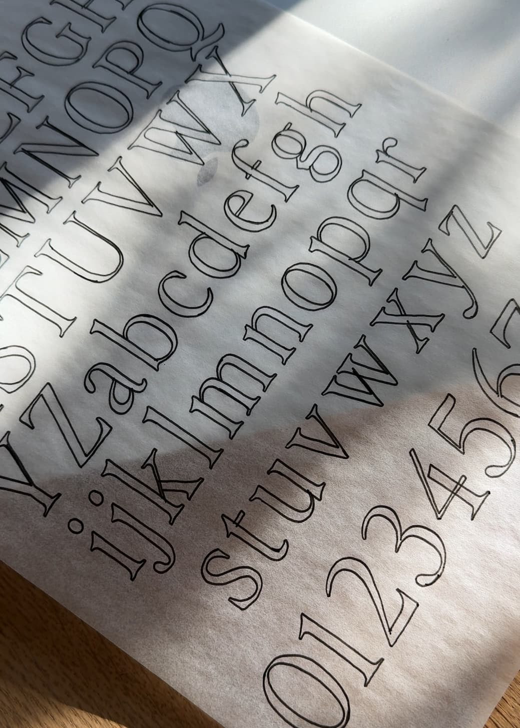
Display fonts are designed specifically for larger copy, like headers, titles, pull quotes, etc. That doesn’t mean, however, that you can’t use fonts that weren’t designed specifically for that to serve those purposes.
For example, you might LOVE how Editor’s Note Text looks for your headers. It’s lower contrast, feels a bit less flashy, and might work perfect for the brand’s vision. By ALL means, use it for the bigger copy!!
The regular version of Editor’s Note also works beautifully for larger headings and subheadings. It just wasn’t designed with that narrow of a scope, if that makes sense. It can be a bit more versatile in where you use it.
Then there’s Editor’s Note Display. This one was designed specifically for use at larger scales like your headers or big calls to action, and the main reason for that more specific use is the extremely high contrast. If you scale Editor’s Note Display down to a subheading or text size, the thin lines can completely visually disappear, making text really tiring to read.

That’s why all three versions of Editor’s Note can work really well in harmony. Editor’s Note Display provides a completely different look for your headers than Editor’s Note (not “better!” Just different!), while Editor’s Note Text makes body copy feel easier to read, all while having the same basic shapes and forms to carry the familiarity all the way through. And Editor’s Note can carry the weight of the subheadings and text that fits between the two scales (although, if we were talking font pairing recommendations, I’d probably use a sans like Neue Swiss or Essential Sans for your subheaders or body copy to provide some contrast to all the serifs).
Basically, all of that is to say that display typefaces should be only be used for large copy, in short blurbs. They can be really tiring for your audience to read, and we really want them to keep reading what we’ve written! So keep your display typefaces for the big, important, TL;DR stuff, and then use something a little less contrasting or easier to read for the longer sentences and paragraphs.
I hope that helps!! Feel free to reach out if you have any questions! : )


Comments +