


Every brand has its own rhythm — its own pulse.
For Onda, that rhythm lives in the space between movement and rest.
A concept brand for natural women’s athletic wear, Onda embodies what happens when performance and softness coexist — the way the body moves through stillness, and strength finds its calm.

The Concept
Onda (meaning “wave” in several languages) was designed to reflect the natural rhythm of motion — effortless, fluid, and grounded. The collection blends performance materials with natural textures, celebrating activewear that feels human, not synthetic.
Visually, the branding needed to match that energy: strong but not rigid, minimal but not sterile. It had to feel sculpted — like muscle in motion — while maintaining a sense of ease.
That’s where Figura Sans and Neue Swiss come in.
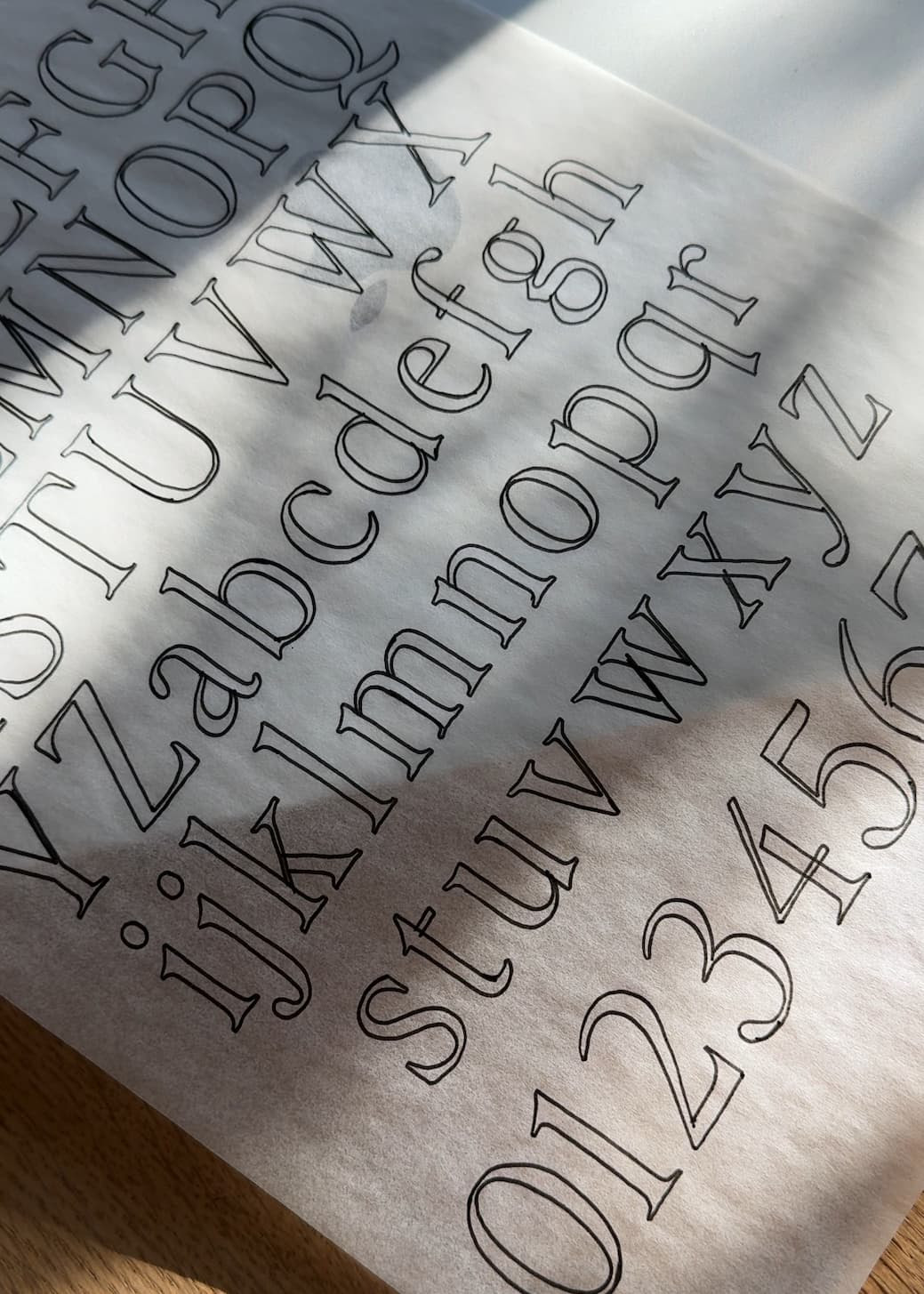
The Pairing
The logo features Figura Sans — a typeface defined by humanist proportions and subtle curves that echo the movement of the body. It’s a sans-serif with intention — modern, architectural, and slightly sensual in its form.
Supporting copy and product text use Neue Swiss — clean, structured, and timeless. It anchors the brand’s visual language with restraint and clarity, providing the framework that Figura’s sculptural presence can live within.
Together, they create balance — the physical and the quiet, the energy and the exhale.

Why It Works
This pairing works because it mirrors the brand’s core philosophy: strength with softness.
Figura Sans brings the warmth and rhythm — it’s expressive, slightly organic, and perfectly modern for a brand rooted in natural movement. Neue Swiss brings precision and discipline — its grid-based design and even tone keep everything feeling grounded.
When paired, the result is a system that feels effortlessly elevated — modern enough for editorial campaigns, clear enough for packaging and digital touchpoints.
It’s a study in contrast: where motion meets control, and clarity meets form.
The Details
The photography stays true to the name — Onda is all about the flow. Light, sweat, texture, and tone come together in a palette that feels alive: sun-warmed skin, clay, ribbed fabrics, and ocean-inspired neutrals.
Typography weaves into the visuals like breath — deliberate, uncluttered, and in rhythm with the imagery.
From stitched labels to campaign layouts, the design tells a story of movement that feels natural, confident, and whole.

Great branding moves with purpose.
Onda reminds us that the most compelling systems are the ones that breathe — that honor both the precision of structure and the freedom of flow.
For athletic, wellness, or lifestyle brands looking to express grounded energy through type, this pairing is one to remember.
Fonts used:
→ Figura Sans
→ Neue Swiss


Comments +