


Every once in a while, a concept comes together that feels effortless — like the fonts and visuals were always meant to meet.
That’s exactly how Glossé came to life.
A mock brand celebrating the ritual of the at-home manicure — soft tones, subtle sheen, and beauty in the everyday.

The Concept
Glossé reimagines nail care as a moment of quiet luxury.
From plant-based polishes to sculptural tools, the brand’s focus is on simplicity, ritual, and self-care that feels elevated but never out of reach.
Visually, it needed to feel tactile — grounded in real textures — while still delivering that sense of calm sophistication. Something that could live equally well in an editorial spread or on a minimalist vanity shelf.
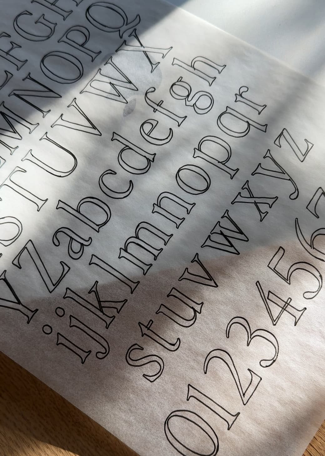
That’s where Perfectly Nineties and Dallas came in.
The Pairing
Perfectly Nineties carries the lead here, setting the tone for Glossé’s identity with its refined curves and quiet strength. It’s a serif that feels timeless — not trendy — bringing an immediate sense of femininity and authority to the logotype.
For the tagline — Color • Clarity • Care — Dallas adds contrast in the best way. Its subtle vintage undertones and geometric proportions ground the softness of Perfectly Nineties, creating balance through texture and structure.
Together, they strike the sweet spot between elegance and modernity — a pairing that feels editorial, yet approachable.
Why It Works
This pairing works because both fonts share an understated sophistication — neither one overpowers the other.
Perfectly Nineties introduces warmth and nostalgia, while Dallas anchors it with clarity and ease. The serif brings the emotion; the sans brings the function.
The result? A brand world that feels premium but familiar — something you’d see in a boutique skincare line or on the counter of a thoughtfully designed beauty studio.
The Details
The color palette stays close to nature: muted greens, soft neutrals, and sheer blacks that feel modern yet organic. Each tone mirrors Glossé’s values — color, clarity, and care — without shouting for attention.
Together, the imagery and typography create a tactile, lived-in elegance. From bottle labels to print collateral, every detail is intentional — a love letter to design that feels real.
Glossé is a reminder that great branding doesn’t have to be loud to make an impact. Sometimes, it’s the balance between form and feeling — between a nostalgic serif and a grounded sans — that tells the strongest story.
If you’re designing for beauty, wellness, or lifestyle brands that need to feel modern yet timeless, this pairing is one to save.
Fonts used:
→ Perfectly Nineties
→ Dallas


Comments +