


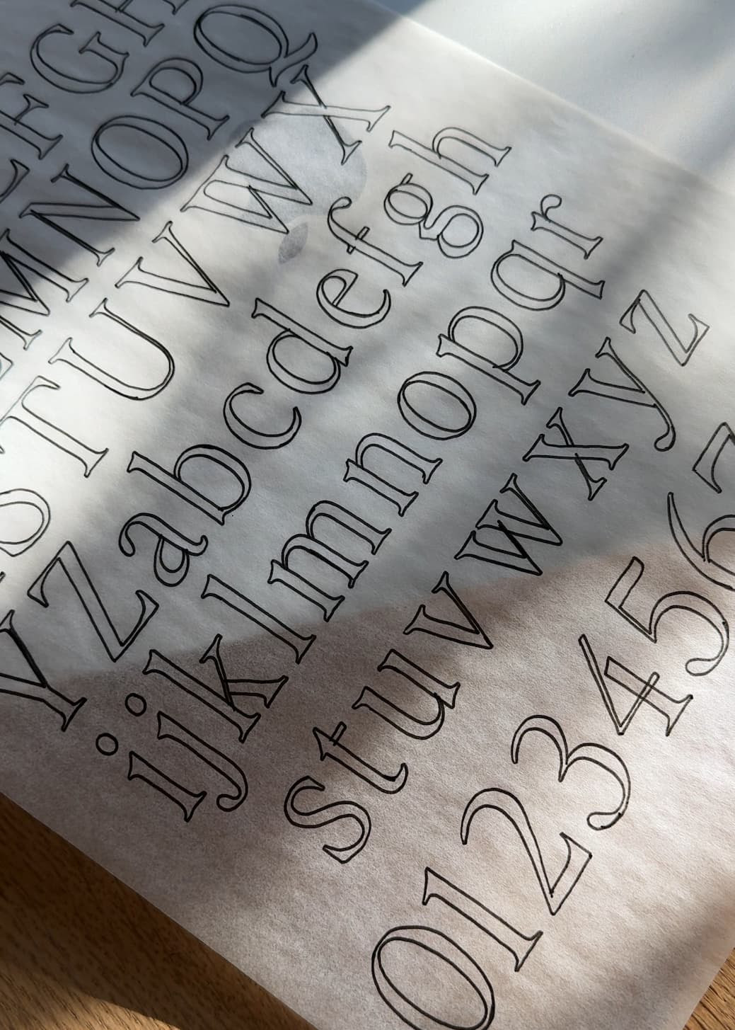
Perfectly Nineties has become one of those fonts that just works — it’s elegant but grounded, expressive but not over the top. Whether you’re designing a beauty brand, a lifestyle site, or packaging that calls for timeless femininity, it instantly gives your work that balance of warmth and sophistication.
But like any good main character, it needs the right supporting cast. Here are five fonts that pair beautifully with Perfectly Nineties — each bringing their own energy while letting it remain the star.

1. Neue Swiss
If Perfectly Nineties is your editorial headline, Neue Swiss is your pragmatic partner. Inspired by classic Swiss design, it brings a structured balance that grounds Perfectly Nineties’ softer curves. The clean geometry and subtle range of weights make it ideal for body copy or navigation — anywhere you need clarity without losing aesthetic harmony.
Why it works: Neue Swiss’ precision and restraint give Perfectly Nineties the breathing room she deserves. It’s a quiet counterpart that supports her elegance rather than competing with it — a perfect example of contrast done right.
Try it when: you’re designing for beauty, wellness, or fashion brands that need structure and style to coexist.

2. Roboto Mono
This pairing might surprise you, but Roboto Mono’s utilitarian rhythm complements Perfectly Nineties in a refreshingly modern way. The monospaced letterforms create a nice tension — expressive serif curves meet precise, measured lines. Perfect for smaller copy, tech-forward brands, or editorial layouts that need a touch of contrast.
Why it works: The balance between Roboto Mono’s logic and Perfectly Nineties’ emotion gives a brand system instant personality. It’s unexpected, but that’s what makes it memorable — especially when you’re bridging nostalgic design with digital-forward aesthetics.
Try it when: you want your design to feel equal parts nostalgic and contemporary.

3. Essential Sans
If you’re after versatility, Essential Sans is your go-to. Its geometric simplicity plays beautifully with the classic personality of Perfectly Nineties. Together, they create a brand system that feels approachable and refined without trying too hard.
Why it works: Essential Sans mirrors the structural balance of Perfectly Nineties but strips away ornamentation, creating a clean, modern frame for her timeless shapes. It’s the kind of pairing that feels polished and cohesive no matter where you use it.
Try it when: your project spans multiple touchpoints — from product packaging to web and print — and you want seamless cohesion.

4. Aguafina Script
For moments when you want to lean into elegance, Aguafina Script adds just the right amount of flourish. Its delicate, calligraphic movement pairs best with Perfectly Nineties’ lighter weights or italic styles. Think high-end wedding stationery, boutique branding, or editorial mastheads that need a handwritten accent.
Why it works: Aguafina Script and Perfectly Nineties share a sense of graceful nostalgia, but in different dialects — one handwritten and fluid, the other structured and typographic. Together they create visual rhythm and texture without slipping into excess.
Try it when: you want to emphasize femininity or create an elevated, graceful moment.

5. Neuton
Neuton feels timeless — it’s a humanist serif with generous curves and beautiful legibility. When paired with Perfectly Nineties, the two create a layered typographic texture that feels both familiar and elevated. It’s perfect for long-form content, print layouts, or brand systems that need depth without distraction.
Why it works: Neuton’s warmth complements Perfectly Nineties’ elegance, giving your typography a cohesive, editorial feel. It’s a pairing rooted in trust — both fonts communicate sophistication through clarity rather than ornament.
Try it when: you’re designing for editorial or brand storytelling where readability and personality go hand in hand.
Perfectly Nineties is one of those typefaces that adapts — she can feel vintage or modern depending on what you pair her with. Whether you lean toward minimalist sans-serifs or expressive scripts, the goal is always the same: balance beauty with utility.
If you end up using any of these pairings in your work, I’d love to see what you create — tag @jenwagnertype on Instagram so I can share your designs!


Comments +