


As design trends shift more and more analog, I started craving type that felt inky, imperfect, and alive.
But I didn’t want to just reach for a handwriting font (although I love those and honestly… I’ve been working on one of those too haha). What I was really craving was a handwritten version of a classic I’ve loved for a long time: Perfectly Nineties.
So I immediately got to work.
There were, of course, complications with going physical versus digital (Procreate tends to be my go-to). I wanted it to feel inky and handmade, but still feel polished rather than messy.

Trial, Error, and a Whole Lot of Tracing Paper
It took a lot… a LOT… of trial and error at first.
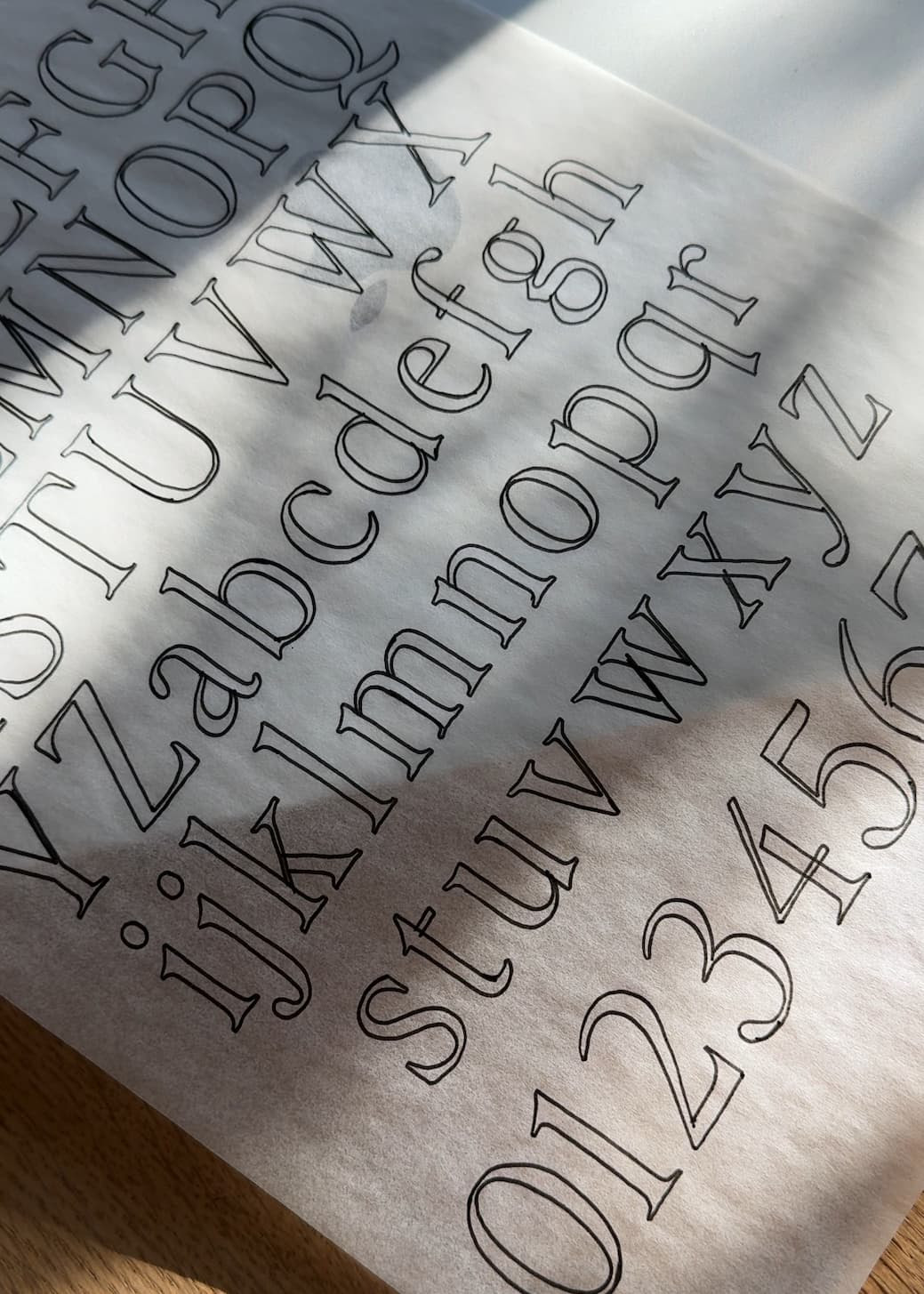
First, I traced each letterform on tracing paper and brought them into Illustrator to vectorize. The issue, however, was that if I traced the letters too small, the texture would feel really inconsistent and even create legibility issues. But too big, and you lose the slight variation that makes the forms feel alive.

Finally, I found the right size and was able to continue tracing out the rest of the typeface. Then came the issue of variance.
Like, what if you have two of the same characters next to one another? Despite it being a serif, I realized I needed to create the same letter variance that I’d create for a handwritten typeface. And so the work doubled. Each letter and number got an alternate to avoid that “this is a font” letter repeat pattern.
(Oh, and they’re all coded as contextual alternates that switch automatically in Adobe programs. YAY).
The Result
It was a labor of love for sure, but also so refreshing to get off my own screen and put pen to paper again in a new context.
And the result is just so fun. It’s beautiful, personal, alive, but still manages to work in elevated contexts if you pair it with the right imagery and complementary fonts.
Shop Perfectly Nineties Handwritten here.
– Jen


Comments +