

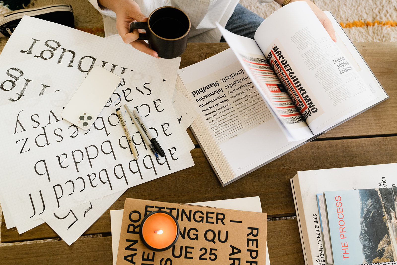

You’ve probably heard of serif and sans serif fonts, but there is a lot more to know about typography than simply choosing whether or not your font has those tiny lines attached at the end of each letter! It’s important to know the basics of typography so you (or your designer) can make the most of your brand fonts.
In this blog, I’m sharing all you need to know about typography so you can confidently choose the perfect font for your brand and then easily and effectively USE it!
What is typography?
Typography is defined as the art and technique of arranging type to make written language legible, readable and appealing when displayed.
If you’re reading this, you’re likely wanting to learn about typography as it relates to your brand.
Type is a visual representation of text and can be used to communicate specific information, ideas and feelings. This goes a long way in supporting your overall brand identity and conveying a message to your target audience!
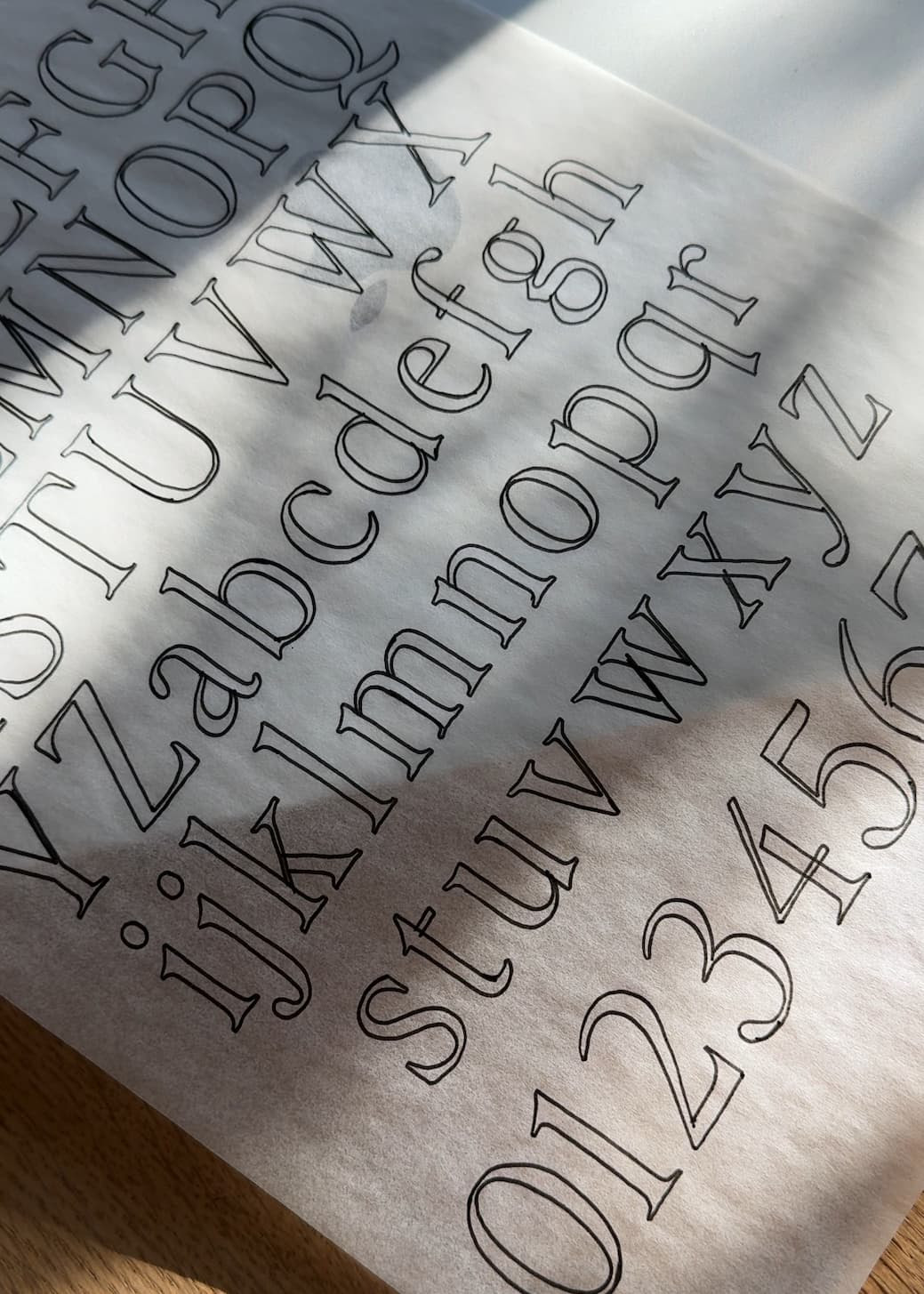
Serif vs. Sans Serif
We’ll start with an easy one!
How do you know if a font is serif or sans serif? Grab a book and skim the pages: the letters probably have little feet at the bottom corners (the “feet” are known as “serifs”). Sans serif fonts do not have those little feet attached (“sans” = without).
You’re probably familiar with Times New Roman (a serif font) and Arial (a sans serif font).
Serif fonts can convey a more traditional, formal, or classic look, while sans serif fonts are more modern and informal. You’ll commonly see serif fonts on printed material and sans serif fonts on screens.
Typography Definitions
Baseline
The baseline is the “invisible” line that a string of text rests upon.
X-height
X-height refers to the height of lowercase letters (excluding ascenders or descenders length). It is typically measured in points, which are 1/72 of an inch. This is an important measure to determine how readable your text will be.
Fonts with a large x-height tend to be easier to read, so keep that in mind when choosing your fonts if you know they will be used in smaller sizes.
Ascender height
Ascenders are those tall letters that rise above other letters (think of the stem on a lowercase b or d). Ascender height is the length from the baseline to the top of an ascender for a specific font size.
Descender depth
Descenders are those shorter strokes that drop below other letters (think of a lowercase g or y). Descender depth refers to how far below the baseline a letter can descend in a particular font size.
Kerning
Kerning refers to how close together letters appear in relation to one another.
Tracking
Tracking refers to space between groups of letters in a word or line of text.
Leading
Leading is referred to as line height. It measures the amount of space between one line of text and another.
Typography is an important part of any designer’s toolkit – it can make or break your message! With a little understanding of the basics, you can be confident as you navigate choosing fonts for your brand, ensuring they are readable, and using them to get your message out in the world.


Comments +