


A nature-inspired home brand concept designed with structure and warmth.

Earlier today, I created a mock brand called Oak Road—a conceptual homewares label built around the idea of nature-inspired living. Think warm wood, soft light, quiet texture, and spaces that feel alive yet grounded.
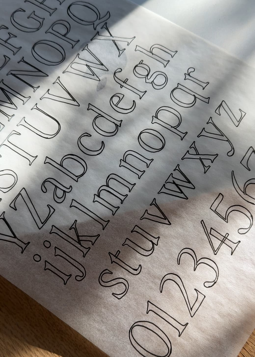
To bring that idea to life typographically, I used Neue Swiss: an eight-weight sans serif that balances precision and simplicity with function and versatility.
Neue Swiss has that unmistakable Swiss-inspired structure—clean, functional, and timeless—but with just enough warmth to keep it from feeling sterile. It’s the kind of typeface that can handle both brand marks and product labels, website headers and editorial spreads. For Oak Road, it anchored the whole visual world: sophisticated enough for a design-forward audience, approachable enough for a home that feels lived-in.
I paired photography that mixes natural forms and crafted materials—branches, buds, furniture grain, light on leaves—to echo the duality at play in Neue Swiss itself. Beauty and function. Form and texture. Nature and design.
Why it works:
- The geometry of Neue Swiss mirrors the structure of established furniture design—measured, intentional, enduring.
- Its range of weights gives room for hierarchy and softness across applications, from packaging to digital.
- The open counters and humanist details keep it from feeling cold, giving every layout a sense of breath and clarity.
Oak Road, as a concept, is about bringing the outside in—translating organic inspiration into refined interiors. Neue Swiss provided the typographic language to express that.
If you’re working on a project that lives in the space between minimalism and warmth—think interiors, wellness, or lifestyle—Neue Swiss might be your perfect match. You can explore all eight weights here.


Images above: Oak Road brand exploration using Neue Swiss.


Comments +