


Acumin is one of the most popular sans serifs out there, known for its approachable geometric forms and wide versatility.
But that doesn’t always mean finding the perfect pair is easy! Here are 5 fonts I’d choose to pair with Acumin:
01. IvyPresto Display
IvyPresto Display is a high-contrast serif typeface that exudes sophistication and drama, perfect for luxury branding and editorial design. With elegant curves and sharp serifs, it’s a favorite among designers who need a bold display font that elevates visual storytelling.

02. Editor’s Note
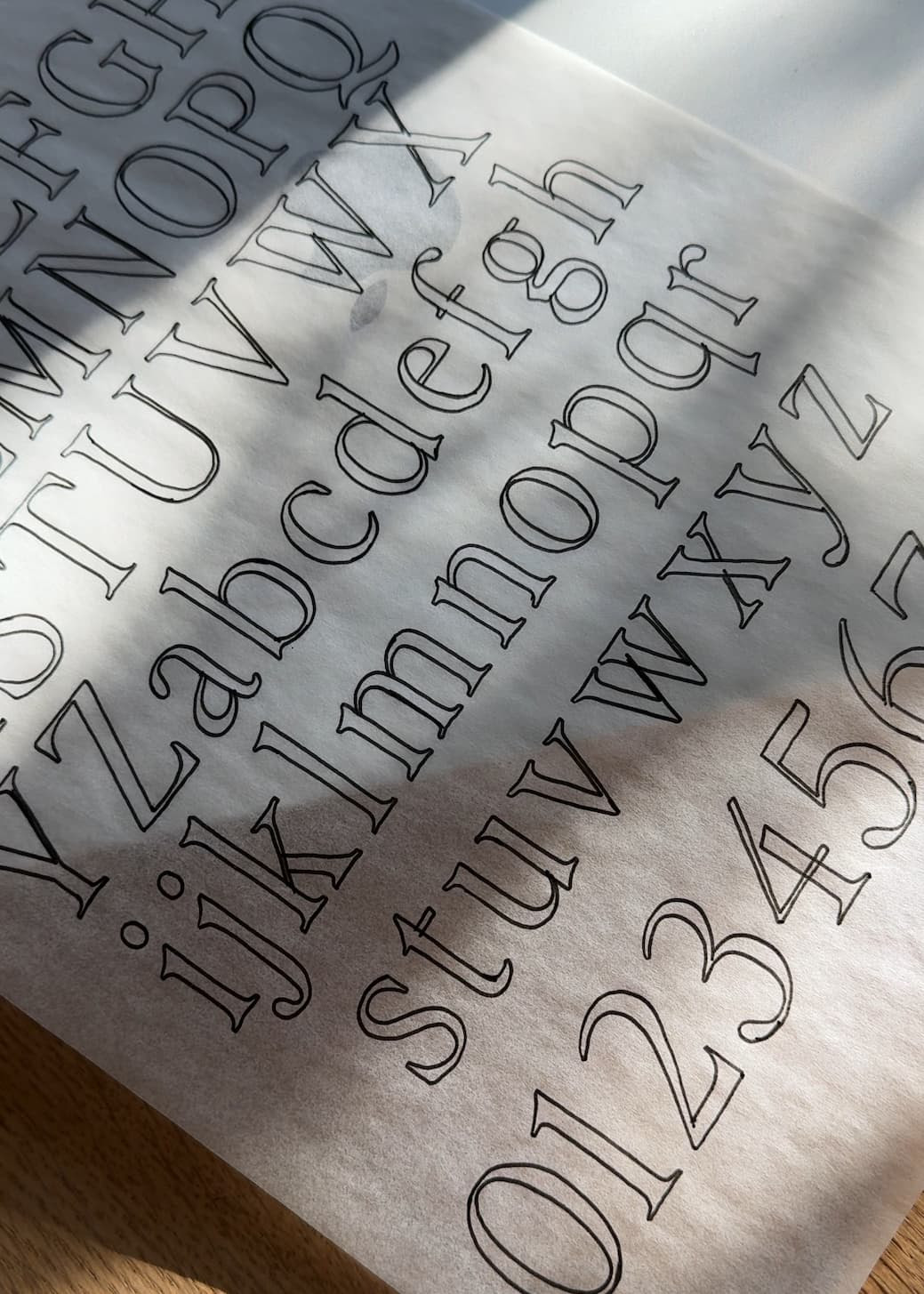
Editor’s Note is a modern serif font designed for effortless readability and refined branding. Whether you’re designing packaging, websites, or pitch decks, this versatile typeface helps creative professionals build cohesive, high-impact visuals with editorial flair.

Want to learn how I pair fonts? Get my free font pairing guide below!
03. Inter Tight
Inter Tight is a space-saving sans-serif typeface built for digital interfaces, perfect for UI designers and web developers. Its modern structure and variable weight options make it a smart choice for responsive layouts, design systems, and contemporary branding.

04. Neuton
Neuton is a classic serif font optimized for on-screen legibility and long-form content. With a refined, literary feel, it’s a strong choice for designers building blog platforms, publishing projects, or book-inspired brand identities.

05. Freight
Freight is a professional-grade typeface superfamily that spans serif, sans, and display styles—perfect for branding systems that demand versatility. Trusted by creative agencies, Freight brings clarity and elegance to everything from logos to editorial spreads.

I hope this helps!! You can find all these typefaces by clicking their names, and you can check out and test Editor’s Note here:

Editor’s Note
Editor’s Note is a stunningly crisp upper and lowercase typeface that looks incredible in large settings as a display text (think big headers, pretty quotes, calls to action, etc.).


Comments +