


Okay, you know how you see a new font and it makes you want to completely change all your branding overnight? (I KNOW that’s happened to some of you before…)
Well… it finally happened. Ethic did it to me.
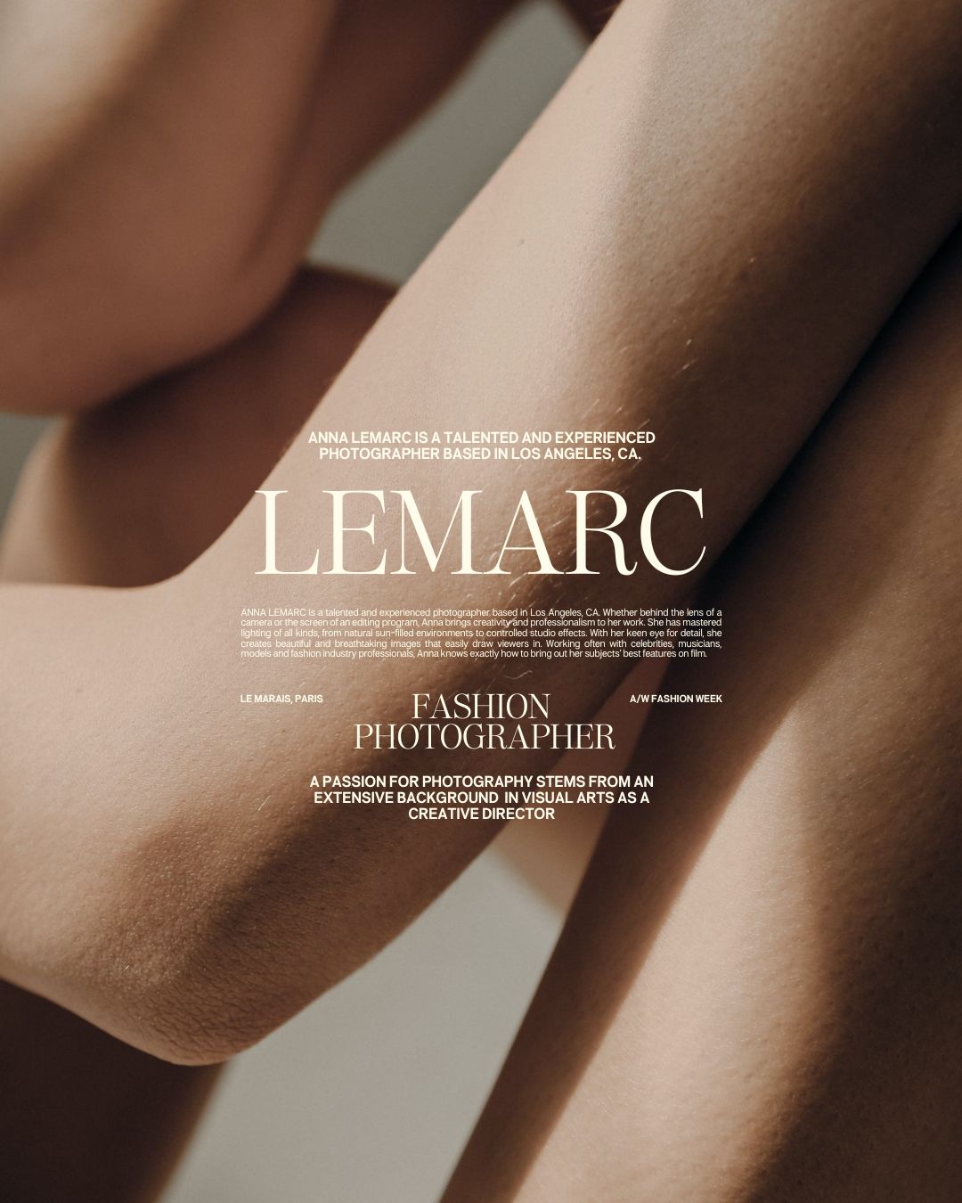
The latest release, Ethic Serif, started from a desire for a timeless, classic serif that stole the show at larger scales, and featured a sharp, spindly italic.
While it definitely ended up being different than I originally anticipated, I think it hits the goal of a crisp serif that deserves all the attention it begs for.
Whether set in all caps, just italics, or either end of the weight spectrum, Ethic is a seriously beautiful addition to any design that needs some timeless class and has room for some large set type.
But as an attention grabber, Ethic tends to need a little more subtlety in its font pairings. Here are a few of my favorites below:
1. Editor’s Note Text
Editor’s Note Text is, at this point, my go-to body copy serif. It’s kind of like the white tee of typefaces: it’s got three weights (hairline, regular, and bold), plus italics, so it’s a good basic with everything you’ll need.
I love how, when paired with Ethic, it looks like it belongs without feeling like it’s a text variant of Ethic. There are enough subtle differences to create contrast that makes them look like best friends rather than siblings.

2. Neue Swiss
Neue Swiss and Ethic are my new obsession (so much so that I changed all the fonts on my site).
Neue Swiss is a super simple, modern sans that shares a similar spirit with Helvetica and other classic Swiss type, but is a little more delicate.
Paired with Ethic, Neue Swiss gives Ethic space to shine and be the center of attention, while also keeping its feet on the ground. They’re a classic “opposites attract” kind of couple and it works really beautifully.

3. Figura Sans
This one actually surprised me. I would have thought that Figura Sans was a little too complex to pair with Ethic, but they actually look really stunning together. I would probably use Figura Sans as body copy, and work it together with Ethic for headers and big text moments, like quotes.

I hope this helps guide some of your pairing decisions! Ethic Serif has completely stolen my heart, and I’ve loved seeing how you pair it with other typefaces (by the way, if you want to show me what you’re working on, submit your work to the showcase here!). I hope you enjoy creating with it as much as I have!
Happy creating!
Jen
Get Ethic Serif


Comments +