


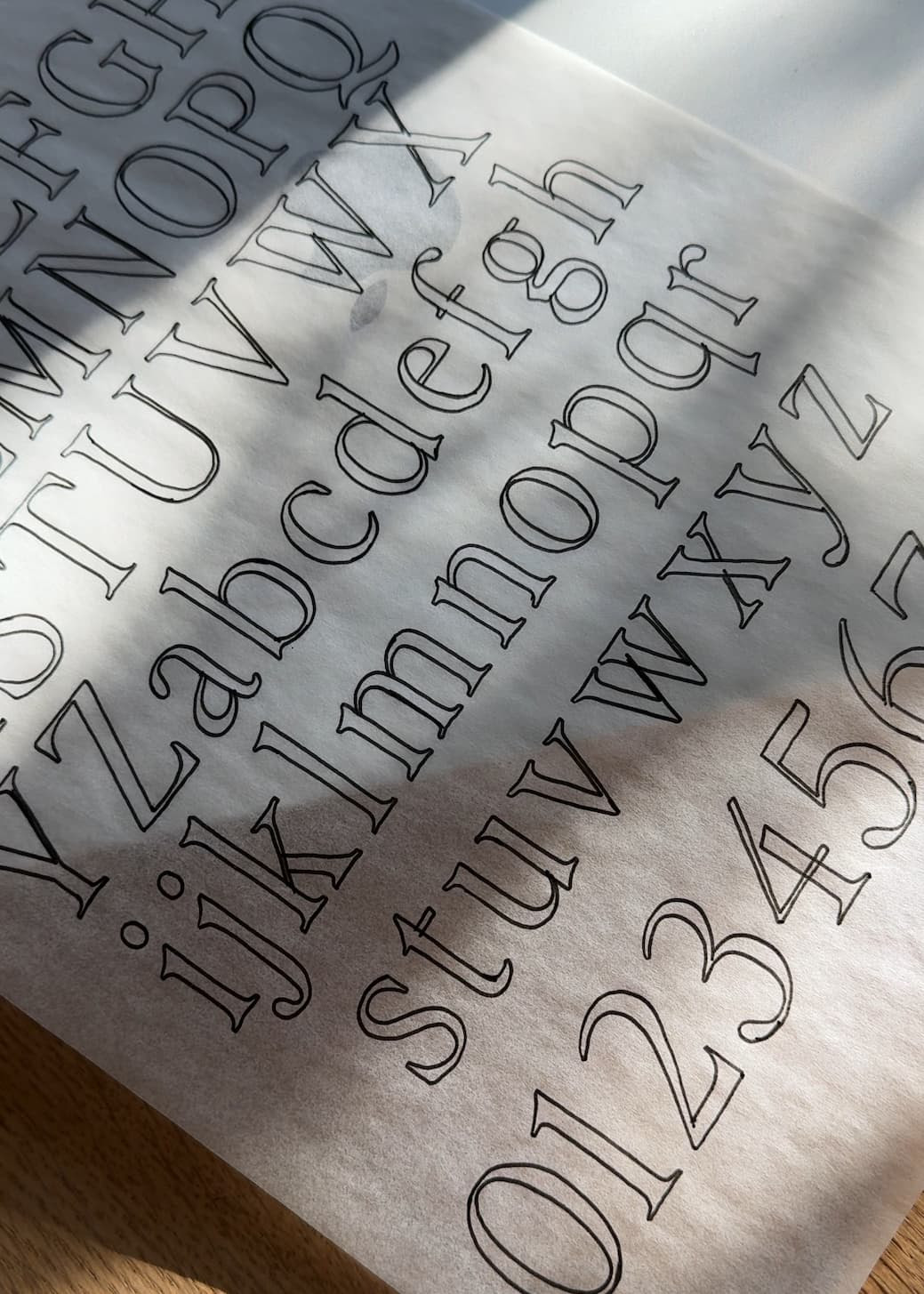
Paso Robles was released into the world last week, and one of my all-time favorite parts of the process is making the images to accompany the fonts.
Namely, finding different font combinations that make the new typeface really shine.
And it was no different with Paso Robles; searching my own library and other free font libraries was such a blast, and created some really fun results that I didn’t really expect (like Anton or just how stunning it would be with Editor’s Note).
Check out some of my favorites below! I also really love it with Bely from Adobe Fonts (designed by Roxane Gataud).

1. Anton
Delicate meets bold with one of my favorite free Google fonts – Anton. This combo is what “opposites attract” is all about! The contrast between these typefaces makes this combo so much fun to use and see sprinkled throughout websites (hellooooo, beautiful CTAs).
If I were using this combination for a website or branding, I’d use Anton as the main attention-getter and Paso Robles as its sidekick, pretty sparingly. It’s one of those combinations that wows, and it’s one I’d want to save for big moments rather than overuse.
Paso Robles, in this context, could also be really pretty when used a quotes or reviews section on a site to give the eye a break from Anton.

2. Neue Swiss
Paso Robles takes Neue Swiss’s simplicity and pairs it with movement and interest. I love using these two together to make something very straightforward feel a bit more inviting and personal.
I think it can be really helpful, depending on the goals and vision of the brand, to use scripts and handwritten elements to humanize design a bit. You don’t always want minimalism to feel cold. I really love finding ways to get the best of both worlds – the simplicity of Swiss design with Neue Swiss, but with the warmth and fingerprint of Paso Robles.

3. Editor’s Note
I mean, Editor’s Note is a given. These two together feel like a disco ball, just reflecting one’s beauty off the other. Overall, this vibe is about elevated luxe meeting human and handmade (like a boutique perfume or a high-end interior designer).
This is another one I wouldn’t overuse, probably just in headings like pictured above. Save it for the “wow” moments when you really want to create emotional impact. It’s like a magic trick or a really good joke – it loses its impact with repetition, and we want to keep this combo feeling fresh.

4. Editor’s Note Text
Editor’s Note Text is a phenomenal option for body copy alongside Paso Robles for accent text; its lower contrast also makes it a really flexible option for logos that need to work at different scales. I love Paso Robles as a signature and Editor’s Note Text as the anchoring type.

5. Ethic
Ethic and Paso Robles move in really similar ways, which was a fun surprise. Ethic Italic and Paso Robles feel really at home and luxe together without coming across as distracting or snobbish.
Paso Robles definitely acts as a sidekick to Ethic in this context. I think they look really great when Ethic is all caps and big, and Paso Robles functions as a guide to get you to the main idea. Think words or phrases like, “As seen in…”, “Loved by…”, “Featuring…”. Let Paso Robles be the host, and Ethic be the waiter.
Curious about how I pair fonts? You can find the basic guidelines I follow plus 9 of my current favorite combinations in my free Font Pairing Guide!

And if you love Paso Robles, click here to grab a license to start using it in your work!

I’ve also included a gallery of some of my favorite Paso Robles images below for easy moodboard building access!


Comments +