When it comes to selecting fonts for yours or a client’s brand, the choice between serif and sans serif fonts can significantly impact the readability and overall aesthetic of your design. Whether you’re working on a website, creating marketing materials, or just choosing fonts for your next project, understanding the differences between these two font families is essential. In this quick article, we’ll explore the key distinctions between each and help you make an informed decision on when to use either (or both!) serif or sans serif fonts.

What Are Serif and Sans Serif Fonts?
Before diving into the key differences, let’s define serif and sans serif fonts:
Serif Fonts
- Serifs: Serif fonts are characterized by the small decorative lines or “feet” attached to the ends of the letters. These embellishments make letters more ornate and distinctive.
- Examples: Times New Roman is probably the most famous; two of my most popular serifs are Ethic and Editor’s Note.
- Use Cases: Serif fonts are often associated with formal and traditional designs, making them suitable for printed materials like books, newspapers, and formal invitations.
Sans Serif Fonts
- Sans Serif: “Sans” means without in French, and as the name suggests, sans serif fonts lack those decorative lines or serifs at the ends of characters.
- Examples: Helvetica (extremely famous and one of my all-time favorites); Neue Swiss and Essential Sans are two of my most popular sans serif typefaces.
- Use Cases: Sans serif fonts are known for their clean and modern appearance, making them a popular choice for digital media, websites, presentations, and informal documents.

Readability and Legibility
One of the most important things to consider when choosing between serif and sans serif fonts is readability and legibility (this can be seriously overlooked, so make sure you prioritize this!!):
- Serif Fonts: The serifs in these fonts can aid in guiding the eye along the text, making them an excellent choice for lengthy printed materials. They are often considered more readable in books and long-form content.
- Sans Serif Fonts: These fonts, with their simple and straightforward design, excel in digital formats. They are highly legible on screens and are a top choice for web design and mobile apps.
Whatever typeface you choose for your body copy, make sure it’s low-contrast enough to be legible at small scales.
Style and Tone
The choice of font can communicate a specific style or tone:
- Serif Fonts: They evoke a sense of tradition, authority, and formality. So you’ll often see them used in academic papers, legal documents, and elegant invitations.
- Sans Serif Fonts: These fonts are associated with a modern, clean, and minimalist aesthetic. They convey a sense of simplicity, making them ideal for contemporary designs and informal content.
Application Matters
Consider the medium in which your text will be presented:
- Print: If you’re designing for print, like brochures or magazines, serif fonts may be a better choice due to their readability in longer paragraphs. On the other hand, display serifs can make for really stunning headers on websites.
- Web and Screens: For websites, apps, and presentations, sans serif fonts are a safe bet. There’s also some more nuance to this – without getting too into the weeds, screens can sometimes translate serifs in a weird way; so if they aren’t specifically designed for screens, sometimes the rhythm can feel a bit off. Sans tend to be a bit more forgiving.

Accessibility
When it comes to web design and accessibility, sans serif fonts often have the upper hand. Their clean lines and simplicity make them more legible for people with visual impairments or reading difficulties.
Combining Fonts
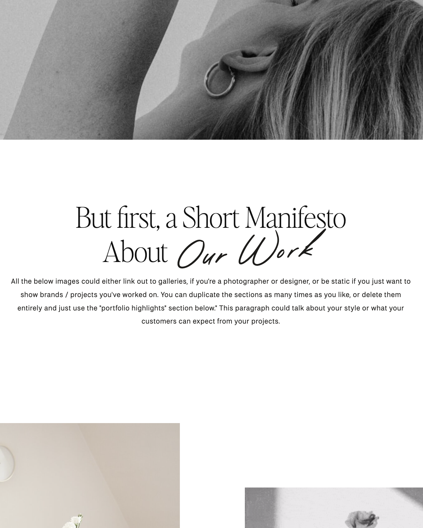
Sometimes, a combination of serif and sans serif fonts can create an appealing contrast in design. For instance, you can use a serif font for headings and a sans serif font for body text to balance readability and style (an example you see all over this website and, truly, my favorite combo). Ethic and Neue Swiss are the fonts in use on my site (at the time of this article, at least!).
Conclusion
The choice between serif and sans serif fonts isn’t about one being superior to the other; it’s about selecting the right tool for the job. Remember, the priority is always ensuring the written word is communicated with integrity. That means the type must properly communicate the tone of the text.
Consider the context, medium, and the message you want to convey when making your decision. Ultimately, both font families have their strengths, and by understanding their differences, you can elevate your design and communication efforts. So, whether you opt for the classic elegance of serif fonts or the modern simplicity of sans serif fonts, make your choice wisely, and let your typography enhance your content.


Comments +