While Editor’s Note Text was designed for body copy, it’s been a pleasant surprise how versatile it can be throughout many different contexts (large and small, print and web, etc.).
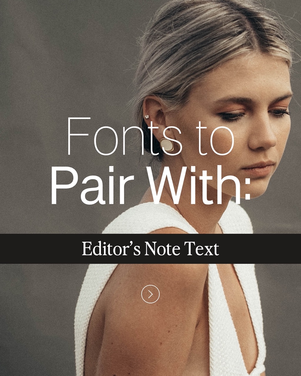
As I’ve been using it more and more, I’m finding new ways to pair it with other JWCo. typefaces that have been so much fun. Here are a few of my favorites!
1. Editor’s Note (Duh)
Editor’s Note and Editor’s Note Text – a match made in heaven.
These two were literally made to go together. The reduced contrast of Editor’s Note Text makes it so much easier to read at small scales, so the lines don’t disappear into the background as the text gets smaller and smaller. Hello versatility!

2. Neue Swiss
Here’s Neue Swiss and Editor’s Note Text to match.
These two are such a timeless and classic pairing. And the versatility is exceptional — this pair works well for everything from beauty brands to a graphic designer’s own branding.

3. Casa Sol
Here’s Casa Sol alongside Editor’s Note Text.
I love how classic these two feel together. They complement one another without having to compete for attention – a match made in heaven!

4. Runaways
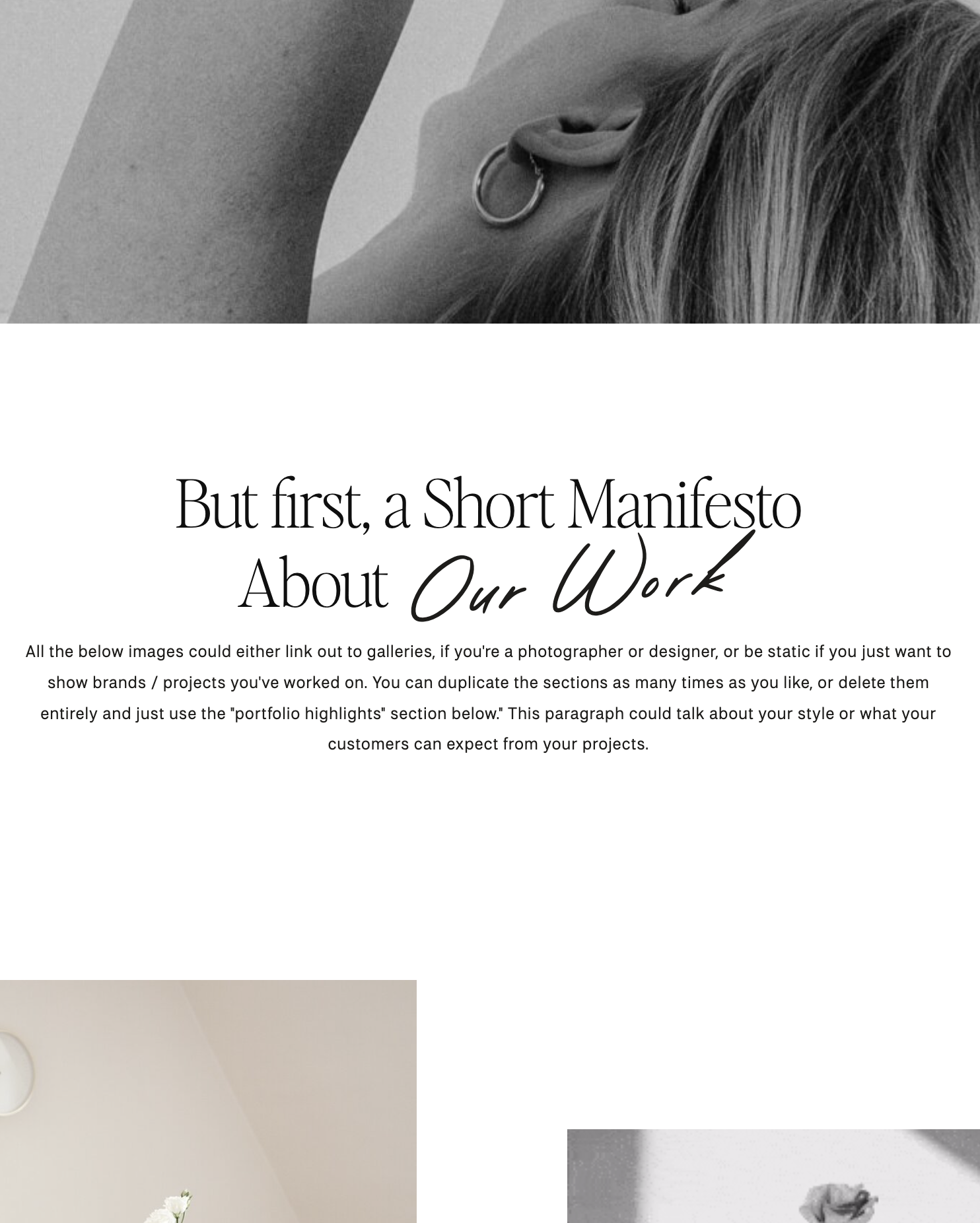
Featuring Runaways and some pretty little Editor’s Note Text – see how the contrast of the bold, modern headline feels great against the smooth curves of Editor’s Note Text?!

5. Sozzani (Plot Twist!)
And here’s Editor’s Note Text paired with Sozzani – surprise!
Editor’s Note Text isn’t just great for body copy. It’s been so beautiful to see in larger contexts as well.
Plus, Sozzani is such a great base option for body copy, it’ll even pair well with, well, body copy.

I hope this helps guide some of your pairing decisions! It’s been so much fun to see how many of you have already used Editor’s Note Text in such stunning ways.
Happy creating!
Jen
Get Editor’s Note Text





Comments +