


Do paid fonts make designs look more expensive than free fonts?
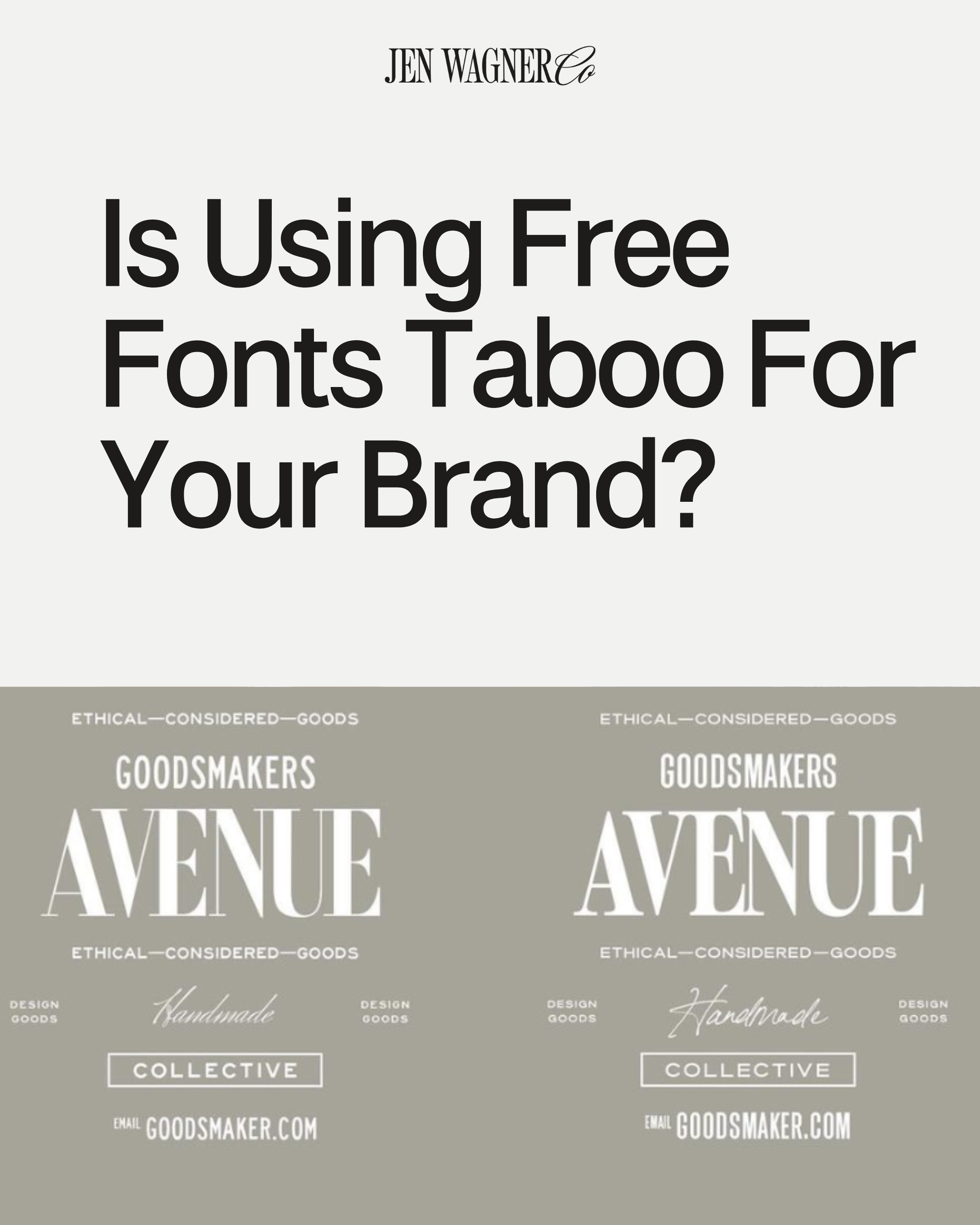
I did an experiment on Instagram where I took a design from a logo template pack and populated a version with free fonts and one with paid fonts. I asked my audience which version looked more expensive and the results completely threw me off!
71% preferred the logo made with free fonts.
Does this mean free fonts were better?
No. What it means is that the free fonts actually fit the context of the question when I asked which one they thought looked more expensive. However, the font choices are not 1:1, they are just different. The stylistic differences between “Luxe” vs “Accessible”.

Fonts are Associated with the Brands That We See Everyday
The winning design on the left has the style of font that you would typically see and associate with luxury brands. A lot of luxury brands will typically use fonts like Didone serif and traditional script. The design on the right looks more “accessible” with the soft-edged serif and the “Handmade” script.
Align Your Font with Your Brand
What does this all really mean? It means that using expensive fonts does not equal expensive designs. The most important thing when it comes to choosing a font is that it aligns with your brand’s goals, strategy, and overall aesthetic. It doesn’t matter if you use free or paid fonts with your brand. If you pay money for an expensive font, then it doesn’t mean that your brand will look any more expensive. Most people wouldn’t even know if you used a paid or free font. It doesn’t matter how much you paid for your fonts if they’re the wrong ones for the brief. If you want your brand to look more expensive, then it all depends on the style of fonts that you use, such as traditional scripts, sharp serifs, etc.
Stand Out From Your Competitors
Think about it. If you want your brand to have a certain vibe, design, or aesthetic, then what are some of the other brands that have those same designs? What are some brands that give you inspiration for your own brand? Most importantly when it comes to brand strategy, how will you compare to your competitors in the same market? You want to make sure that your brand stands out, so that could be a factor when you are selecting the fonts that you want to use for your brand. Whether those fonts are paid or free doesn’t actually matter.
Before this experiment, I always felt like using free fonts was taboo or “not allowed” for client work. Or like, it’s okay when you’re starting out but not if you’re gonna be taken seriously. I’m so glad I debunked myself!
There is absolutely no shame in using free fonts. It’s about using the right fonts for your brand.
Maybe a little controversial to say as someone who designs and sells typefaces as a career, but the truth is the truth! What do you think about this?


Comments +