The latest release, Figura Sans, started off as experimenting with a contrasted sans and ended up becoming one of my favorite typefaces I’ve designed to date!
It’s surprisingly versatile and works better than I could have ever hoped for not only display and large type settings, but smaller contexts like body copy (especially on websites – sooooo pretty!).
As I’ve been experimenting with Figura Sans more and more, I’ve found it can be slightly tricky to pair with other typefaces without it feeling too busy.
That’s why I’ve shared some of my favorites below 🙂
1. Avanti
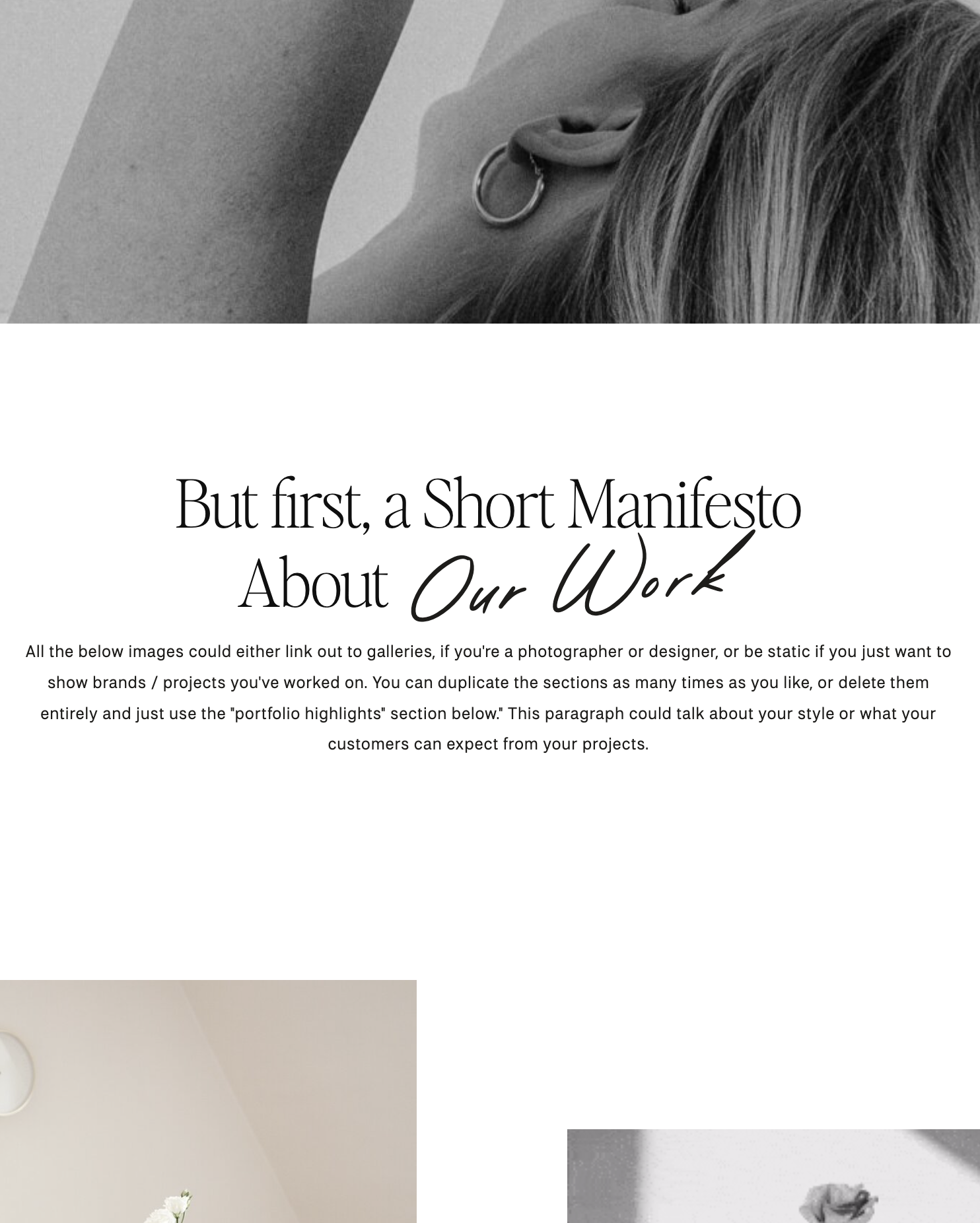
The classiness of Figura Sans paired with the laid back and casual vibe of Avanti make for such a pretty font pairing! It’s the perfect combination of elevated and accessible, and both typefaces are versatile enough to work well for both web and print.
I love this look for skincare or beauty brands, but also think this combo could look great for coaches or service-based businesses.

2. Editor’s Note
Editor’s Note and Figura Sans take luxury to a whole new level.
These two typefaces work together seamlessly to create a high-end feel that commands attention. Plus, they both come in multiple weights from light to bold, so you can mix and match to create whatever look supports your brand best!

3. Pinyon Script
Pinyon Script is free script that I’ve been loving alongside Figura Sans.
It’s understated and elegant, and doesn’t command too much attention or focus but adds so much beauty and class to designs, it’s unreal.
You can find it for free on Google Fonts!

4. Neue Swiss
The crown jewel of font pairings (in my opinion!): Figura Sans and Neue Swiss.
This typeface combination is SO clean. I love using Figura Sans for headers and Neue Swiss for body copy (or even all-caps subheadings).
Each features clean lines and timeless figures while also sporting multiple weights for extra versatility.

I hope this helps guide some of your pairing decisions! Figura Sans has definitely become a favorite that I reach for often, whether for body copy or for beautiful display type like logos and headings. I hope you enjoy creating with it as much as I have!
Happy creating!
Jen
Get Figura Sans


Comments +