


I’ll be honest, this was a tough one!
Neue Swiss started back in February when I was in the midst of numbingly deep burnout. I had tried time and time again to get back to creating, and couldn’t manage to do much without severe anxiety and my mind (and body) shutting down.
It was like every part of me was begging me to rest, despite still having the desire to work and create.
But that’s a story for another time.
Neue Swiss was actually my first glimmer of light at the end of the tunnel. Designing the first few letters felt like a relief. It wasn’t a grind or a fight to get the concept down, and it gave me hope that I’d, one day, resurface from the burnout I was experiencing.

It all started with an exercise: let’s make a few letters that feel very “Swiss design” (think Helvetica, Univers, etc.). There was no pressure to create a full typeface, just to try and do a tiny bit to get creating again after a difficult few months.
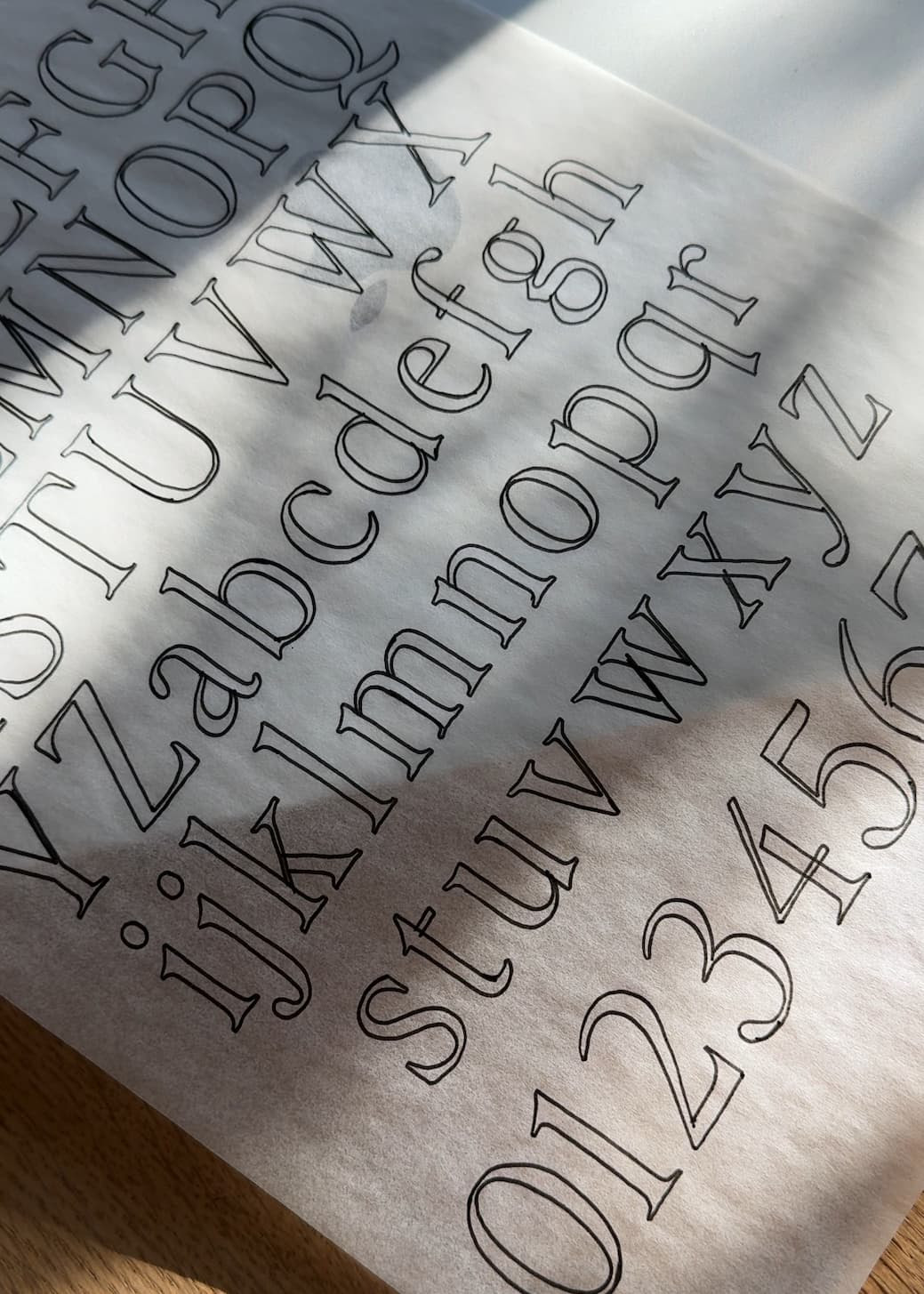
I decided to work on the letters n, o, a, and c. I knew I wanted the inside curves of letters like n, h, b, etc. to be totally round rather than have an obvious branch (see the difference between Neue Swiss and Essential Sans below); and I wanted the curves of the a and c to be really clean and no-nonsense. The terminals meet on a horizontal line instead of at an angle, which made everything feel a little more serious.

And that was the whole concept! Those few letters set the rules for the rest of the character set, and I felt like if it came together at all like those first few letters, this would be a total breeze and I’d be back to creating in no time.
Welp haha. Moving forward and developing the full typeface was a bit more of a challenge.
This isn’t super common knowledge, but sans serifs are really hard to create. There’s a lot of nuance and they tend to be way less forgiving than serifs, so there was definitely a lot of very subtle adjusting and perfecting in order to get this to feel right.
But oh my goodness, does it feel SO right!
The more I’ve used Neue Swiss through testing and making sure everything looked and worked properly, the more I fell in love with it.
Unlike my first sans family (Essential Sans), Neue Swiss is much more luxe, serious, and elegant.
While Essential Sans is super approachable and friendly, Neue Swiss takes on a more VIP, exclusive tone. It feels expensive, and helps make designs look that way as well.
(Like this pairing with Editor’s Note Light – I just about fell off my chair)

Anyway, my hope for you is that your experience with Neue Swiss mirrors mine – that it’ll be a typeface you fall love with (more and more with each use!) and that it elevates every design you incorporate it into.
And hopefully that it doesn’t want to make you rebrand too badly (although it definitely caught me on that one haha).

Click below to grab a license for Neue Swiss. I absolutely cannot wait to see what beauty you create with it!
Jen


Comments +